Physical Address
304 North Cardinal St.
Dorchester Center, MA 02124
Physical Address
304 North Cardinal St.
Dorchester Center, MA 02124
Empowering Smarter Business with IT
Empowering Smarter Business with IT
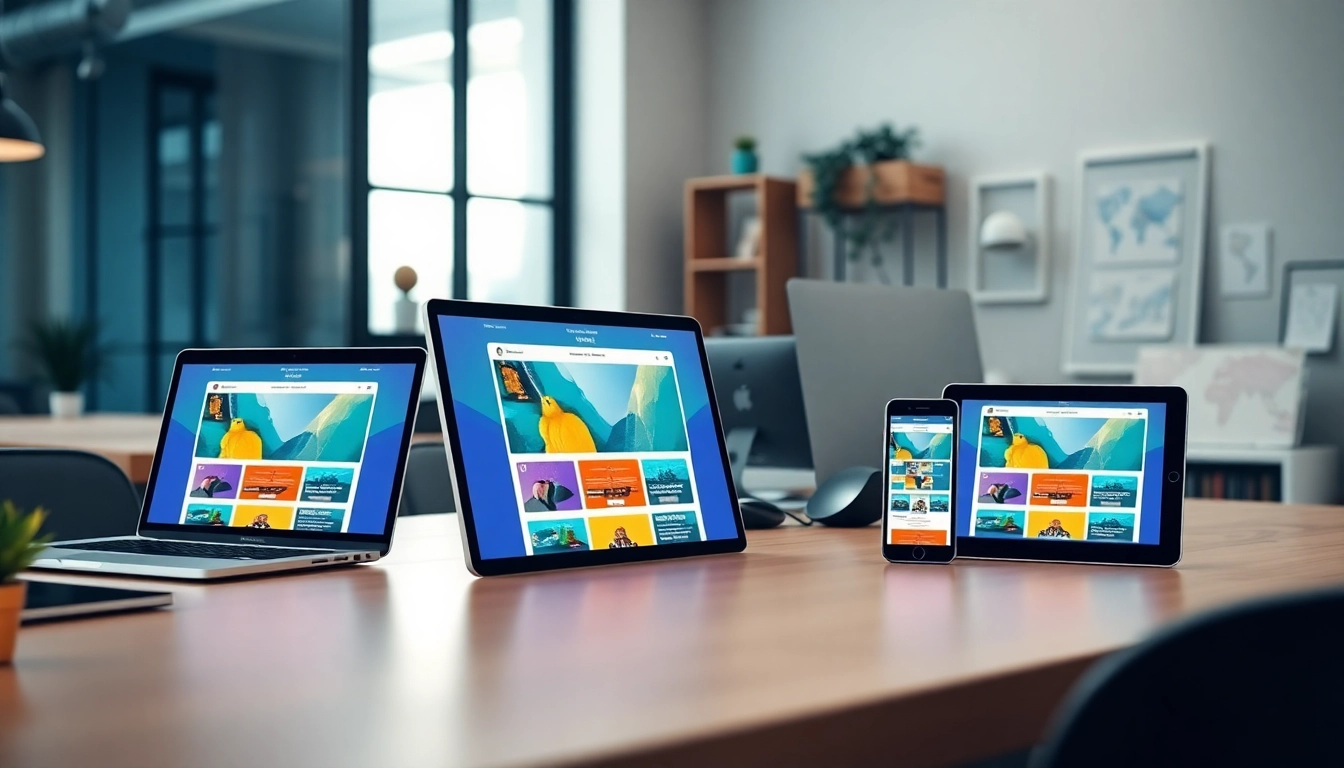
This guide explores how responsive design media queries can transform your website’s performance across all devices, using intuitive website builders and strategic tips to help your business scale.
If your website doesn’t adapt smoothly across screens, you’re losing customers right now—simple as that.
Studies show that 57% of users won’t recommend a business with a poorly designed mobile site. For solopreneurs, small business owners, or startups with tight budgets, this could mean the difference between gaining a client and being ignored completely.
Google uses mobile-first indexing—meaning it crawls and ranks the mobile version of your website first. A rigid, desktop-only layout leads to lower rankings. Responsive design media queries help you remain competitive in search engine results, directly impacting organic traffic and leads.
Visitors move fluidly between devices: they may find your site on mobile, return via tablet, and convert on desktop. Responsive design ensures consistency in user experience, eliminating friction and increasing the likelihood they’ll take action—subscribe, buy, book a call, etc.
Responsive design isn’t just aesthetic—it’s a mechanism for scalability and user trust. In markets where competition is ruthless, even a few lost conversions can snowball into missed milestones. Responsive design media queries empower your website to be future-proof, accessible, and growth-ready.
Media queries are the brain behind responsive design—they allow your site to react intelligently to different screen sizes and device capabilities.
Media queries are CSS rules that apply styles based on the conditions of the user’s device—such as screen width, height, orientation, resolution, and more. They essentially say: “If this is the screen size, then show these styles.”
@media (max-width: 768px) {
  body {
    font-size: 16px;
  }
}
This snippet tells browsers: “If the screen is 768 pixels wide or smaller, apply this font size.” That’s how responsive design media queries make your site adaptable.
Here’s how media queries give you control without bloating your codebase:
Whether you’re using Bootstrap, Tailwind, or custom HTML/CSS, responsive design media queries work seamlessly across frameworks—making them indispensable for delivering high-quality UI across smartphones, tablets, desktops, or even TVs.
Responsive design runs on the fuel of media queries. Mastering them means taking control of every user experience your brand offers.
Don’t want to hand-code responsive design media queries from scratch? You don’t have to. Several powerful website builders handle the heavy lifting for you—and do it extremely well.
Website builders today are far more than WYSIWYG conveniences. They’ve become powerful platforms that integrate responsive design media queries deeply into their workflows. Choose the right one, and you’re freed to focus on what really matters—growing your brand.
Even with the best tools, responsive design media queries can backfire if misused. Let’s walk through the biggest pitfalls that keep websites from achieving true flexibility.
Using desktop styles as your primary design and tacking on mobile corrections later causes bloated, brittle CSS. Instead, always start with mobile-first media queries and scale up.
@media (min-width: 768px) {
  ... // tablet and up styles here
}
This way, your site works on mobile by default and grows better on larger screens.
Some developers rely on a media query for every minor screen change. This creates spaghetti logic that’s impossible to maintain. Stick to 3–4 critical breakpoints (e.g., 480px, 768px, 992px, 1200px), and use flexible units like percentages or ems for everything else.
Assuming your responsive design works just because it “looks fine” on your monitor is dangerous. Always test:
Instead of adjusting content layout, some developers just hide entire blocks on smaller screens. This hurts SEO, user experience, and accessibility. Redesign your elements to transform—not disappear.
Buttons, links, and form inputs must be large enough (minimum 48px x 48px) to tap on touchscreens comfortably. Overlooking this reduces usability and discourages conversions.
These mistakes are common but completely avoidable. By strategically implementing your responsive design media queries with thoughtful intent—not just patching things up—you build sites that are elegant, robust, and future-ready.
You don’t need to rebuild your entire website to improve responsiveness. Here are fast, proven action steps to start implementing responsive design media queries now and see immediate improvements.
Document visual bugs, spacing problems, and functionality gaps.
Use the following common breakpoints as a base:
Be sure to write mobile-first media queries, scaling styles upward using min-width rules.
Switch from px to %, em, or rem where possible. This lets content scale fluidly without needing multiple media queries for every device.
srcset or use tools like Responsive Images that load variants based on screen resolution.Faster loading equals lower bounce rates.
A/B test your design changes using tools like Google Optimize or Microsoft Clarity. Monitor real user behavior to validate responsive improvements.
Implementing these changes one step at a time will help you build a website that not only survives but thrives in today’s cross-device digital landscape—all thanks to strategic use of responsive design media queries.
Responsive design media queries aren’t just a developer’s fancy—they’re mission-critical tools for anyone serious about growth online. Whether you’re building an MVP, running an agency site, or managing a personal brand, responsiveness is non-negotiable. We’ve unpacked why it matters, how media queries work, what platforms do it best, common errors to avoid, and—crucially—immediate actions you can take today.
This isn’t about chasing trends—it’s about delivering consistency that converts, loading speeds that retain, and experiences that build loyalty.
In a world where users swipe, tap, and scroll across dozens of devices, the question isn’t whether you can afford to focus on responsive design—it’s whether you can survive without it.
Your website’s future is already in your visitors’ hands. Make sure it looks perfect there.